I remember the family plan in Medellín: go to the video store and rent movies. Blockbuster and Betatonio defined those years. I always ended up at the horror shelf. I was around 12 when I saw Friday the 13th and Freddy on TV, and the genre has captivated me ever since.
In those days, watching a trailer quickly was not possible. Your choice was based on the box picture and the short synopsis on the back cover.
Several years and numerous horror movies later, I noticed something: those boxes were colorful, with drawings and illustrations that grabbed you from the shelf.
Streaming isn't that different. The platform shows you a version of the cover picked for you, to hook you; then comes a short blurb and, sometimes, a trailer.
I decided to investigate the visual components horror relies on to generate fear and how they have shifted over the years.
I can't measure the boxes from my video store, and streaming covers change depending on who's looking. Posters I can: every film has one, from 1900 to today.
I examined 33,619 horror posters in total. One catch, up front: I used the poster TMDB lists as each film's main one today, which for old films is often not the one that hung in theaters. I reviewed 903 films from 1930 to 1999 alongside their release posters: the originals are about 8 points brighter and, before 1950, show more faces. If anything, what you'll see here is understated.
About the data
From TMDB's horror titles I kept 33,619 English-language posters with usable art, from 1900 to 2026: already released, no adult flag, no Animation, Music or TV Movie, plus a few exclusion lists. Each one is the poster TMDB listed as the film's main image on October 8, 2026, and each was measured the same way. The charts illustrate the changes. As for why they changed, that’s just my take, and I’ll be sure to clarify when I’m speculating. The fine print is at the end.
Exhibit A · The instruments
The Method to
Measure a Sheet
Each chart that follows uses the same instruments. Here they are, on one poster — Halloween (1978). Tap a measure to view its construction and learn to read the number.

Tap a measure
How it's built
How to read it
Same instruments. Now the whole century.
Part I · Color River
Black Took the Sheet
Look at the colors. In the 1950s, horror posters remained warm, with a quarter of the sheet in orange and amber, a style dating back to the 1920s. Then the color drained out. During the '60s, the sheets lost color and turned grey; from the '70s, the grey gave way to black. The '80s get a quick flash of blue (neon fear). It doesn't last. Black wins. Near-black pixels increased from 29% of the sheet in the 1950s to 51% in the 2020s. The warm colors never really come back.
My reading. The warm '50s aren't random. That was the atomic age — bright reds and radioactive greens sold COLOSSAL TERROR! at drive-in theaters. The blue flare in the '80s? That's VHS neon, the video-store era. And the black flood that never recedes? That's horror learning to be scary without color at all.
One thing to keep in mind while you read: not everything below belongs to horror. Thriller, mystery and sci-fi posters showed fewer faces and less text over the same century, and I measured them the same way (Part VIII). Black stays specific to horror, covering 51% of the sheet in the 2020s versus 40–44% elsewhere.
FULL CENTURY — n = 33,619 posters (TMDB), mean share per decade. Black/Grey counts every near-black pixel and every grey or white one (low saturation).
One real poster per hue family the chart measures — the sheet where that band actually dominates, per era.
On phones: swipe each row across the six eras. Showing Reds & Black/Grey first — the two bands that drive the story.
Selected by dominant hue-band pixel share (same six families as the river), favoring recognizable illustrated sheets over blank title cards.
Part II · Darkness
Posters Got Darker After 1970
I anticipated brightness would rise and fall as usual. But this wasn't normal. Horror posters have kept getting darker for more than fifty years, with no real rebound. The light never came back.
It isn't a slide — it's a mountain. Brightness holds a broad plateau from the mid-'40s to the '70s, topping out around 1970, then drops in the '80s and never recovers. No rebound.
My reading. For me, two films mark the turn: The Exorcist (1973), terror inside the home and the faith, and The Texas Chain Saw Massacre (1974), human brutality with no filter. The first already has a night poster. The second is still bright. Posters didn't all change at once.
FULL CENTURY — n = 33,619 posters (TMDB), 5-yr rolling mean.
The brightest and the darkest poster I measured in each era — the two ends of the mountain.
Selected by mean L* brightness, one extreme specimen per row per era.
Part III · Red & Blood
Red Peaked Around 2000
You'd think the '80s slashers owned the color red. They didn't. Red is horror's signature — but its real peak isn't where you'd guess. Not the slashers. The meta-horror turn of the millennium.
My reading. Why the delayed peak? The '80s slasher era was born from VHS. That decade saw more than 1,300 horror films in this corpus, and posters had to scream red from video store shelves to stand out. But by the 2000s, red had become a language. Meta-horror (Scream, Saw, Final Destination) used blood as an aesthetic — not a threat.
FULL CENTURY — n = 33,619 posters (TMDB), 5-yr rolling mean.
What the reddest poster in each era actually looked like — and, just as telling, what a horror poster with essentially no red looks like in the same years.
Selected by red-pixel share (HSV red-hue mask), extremes per era.
Part VII · Two Kinds of Blood
Blood No Longer
Has to Be Red
This is the strange part. Red does not mean the same as blood. The chart above measured a color. This one measures a concept: does it look like blood, regardless of its color? Through the 1990s, the two measures rise together. Then they part: the color drops to about a tenth of the sheet, while blood on the sheet peaks in the 2000s and stays well above its '80s level today.
My reading. The split makes sense: after the slasher boom, blood became a symbol — not just a color. It could be black, brown, dark red, or even implicit. Meta-horror posters (Scream, Saw) treated blood as a language everyone already understood. You didn't need to paint it red anymore. The audience knew.
Pixel-red: FULL CENTURY, n=33,619 (TMDB). Model-detected blood: ALL POSTERS, n=33,619, CLIP zero-shot per 2×2 poster patch — validated against hand-inspected artwork (Jaws, Friday the 13th, Blair Witch) before trusting it. Decade means.
Where the two measures in the chart above actually disagree, poster by poster: high pixel-red with zero semantic blood detected, and the reverse.
Both rows come from the same blood model as the chart above, run on all 33,619 posters; "blood" is CLIP's blood score. Bottom-row specimens hand-checked for literal blood — early high scores often fire on red cloth or type instead; the first cell is the earliest verified case shown (1959).
Part IV · Faces & Monsters
More Ghosts.
Fewer Faces.
Something instinctive arises when a face looks back from a poster. It tells you what to fear. I posed a simple question spanning the entire century: who is looking back from the sheet? First, the human face. Then the creature. Together, these elements reveal one story: horror figured out how to evoke dread without focusing on a star, while the monster's throne was passed around. And the ghost, which led once before (narrowly, in the 1940s), tops the CLIP census today (a second model, Nova, puts it second to the masked killer).
Fewer faces looking back. In the 1940s, that stare was nearly mandatory — 87% of sheets had one, the century's peak. The rolling curve hits 91% in 1945. Today, fewer than half do. The decline isn't steady: it drops after 1960, again around 1980, and once more in the 2010s, when the share settles near half. And hiding inside the long retreat, one twist: the late '90s didn't add faces; they zoomed in on them. Face size peaks around 1998–2002 — the celebrity close-up era: on sheets that show a face, it fills about 13–14% of the sheet, against 8% in 1950–89 (and 10% in the 1930s–40s). Those zoomed-in faces had names. Scream put five of its cast on the sheet; The Faculty, six. Among well-known horror films (100+ TMDB votes), 53% of the late-'90s posters sold a star from the cast (93 posters, 95% interval 43–63%); today 36% do (800 posters). The faces that dropped off are mostly the small films' faces: today 59% of well-known films' posters show a face, against 47% of the rest, and 36% carry a cast star, against 5%.
My reading. The data don't say faces disappeared. They show that faces declined, reaching about half in the 2010s: from about 63% of posters with a face in 2000 to about 51% by 2015. I remember the Sinister (2012) poster from those years: a girl with her back partly turned, hair over her face, painting a face on the wall in blood. No face meets your eyes, but there is one.
ALL POSTERS — n = 33,619 posters (TMDB), YuNet face detection (validated against hand-checked artwork), 5-yr rolling mean. Counts are floors: small, profile, tilted, or heavily painted/illustrated faces can escape the detector. STARS — Rekognition celebrity recognition on the 17,018 posters with a face, kept only when the name is in the film's TMDB cast (3,161 posters); well-known = 100+ TMDB votes. A floor: lesser-known actors aren't recognized.
The two faces this chart is actually made of: the extreme close-up, and the poster with no detectable face at all.
Selected by YuNet face-detection output (number of faces and face-box area) — the close-ups shown fill roughly half to all of the sheet. Zero-face row: hand-checked so the sheet really has no readable human face (silhouette, creature-from-behind, egg, light-for-a-head) — not detector misses on painted or tilted faces, which YuNet also produces.
In Asia, the face stayed. It left English-language horror posters, not Asian ones. Since 2000, 49% of English-language horror posters show a face. Japanese: 66%. Thai: 82%. Spanish, French, German and Italian horror sit right next to English. Japan dipped and came back: 75% of its posters showed a face before 1980 (112 posters), about 61% in 1980–2009, 69% today — while English kept falling, to 48%. And the title kept shouting. Put a Japanese horror poster next to an English one: the film's name is over a third bigger — 16.5% of the sheet's height against 12.0%. Korea and Thailand don't follow; their titles sit at English size or below.
OTHER LANGUAGES — horror films outside the 33,619-poster English corpus, measured with the same method, face detector (YuNet) and filters. Top: 4,598 posters from 2000–2026 in the 12 languages with 150+ posters; lines are 95% intervals. Bottom: every year, grouped by era (hover a point for its n). About a third are the film's English-market poster; the gap holds for both versions. Creatures don't split the same way: 27% of English-language posters show one (CLIP census) against 16–25% in the other languages, but among films with 10+ TMDB votes the intervals overlap. TITLE SIZE — PaddleOCR on 2,508 Japanese, Chinese, Korean and Thai posters and a sample of 600 English ones; the comparison uses the 2000–2026 posters where the title was found (475 of 599 English, 638 of 829 Japanese, 169 of 246 Korean, 124 of 217 Thai); median height of the title's largest line of letters, with 95% intervals: English 12.0% (11.3–12.7), Japanese 16.5% (15.7–17.2), Korean 13.0% (11.9–14.9), Thai 10.2% (9.3–11.2). 37 of 40 boxes checked by hand measured the right line. Part of the gap is the script: a kanji title of two to four characters fits larger than an English word.
The monster census. As the human face recedes, another presence often takes its place in the stare. I asked a vision model one question about every poster: what creature is on it? The answer is a dynastic succession, ending with the ghost: in the 2020s, it ranks as the most common creature on this census, appearing on 23% of labeled posters, more than double the runner-up. A second reader (Nova) ranks the masked killer first and the ghost second, so the order at the top depends on the model — switch the reader above the chart to see Nova's version. Nova names a creature on more posters (54% against 27%), so its shares are higher, and its curves differ most in the middle decades: it finds masked killers on 23% of the 1980s posters, and CLIP on 4%. Before 1950, the number of labeled posters was too small to name a leader (13 in the 1920s, 27 in the 1930s). The chart keeps the ghost and the masked killer lit; the other thrones stay dim until you tap or hover a line.
FULL CENTURY — n = 33,619 posters, CLIP zero-shot vs 18-creature taxonomy (checked on 10 hand-checked posters (9/10; the miss is Annabelle) and against a second reader, Nova, which agrees on 67% of the labeled posters (82% when Nova names a creature); labels below 0.5 confidence excluded). Shares are conservative floors; pre-1950 decades carry smaller samples. About 7 in 10 posters carry no creature label (below 0.5 confidence), so the shares describe posters that show a recognizable creature; before 1950 each decade has fewer than 70 labeled posters.
Two real posters per era for whichever creature actually held the throne, per the chart above.
Selected by top CLIP-classified confidence within each era's reigning label(s) named in the chart's own copy above — where two creatures co-reign or hand off mid-era, one specimen of each.
Part V · Text & Composition
Half the Text
of 1960
Picture a 1950s shelf: painted, dimensional letters SHOUTING at you. Now, lean into a 2020 lobby card — one thin word on black. You have to get closer to read it. That whisper is scarier than a shout. Three shifts, measured across every poster. First, from the silent era until 1960, text occupies roughly one-third of the sheet — the "SEE! SHOCKING!" years. Then horror lowers its voice to about a quarter of the sheet by the late '70s, dropping to 18% today after 2010. The first drop is supported by an OCR check, while the second is not (see the note below the chart).
My reading. The 1950s shout wasn't random — drive-in theaters were exploding. Posters had to grab you from your car window. By 2020, posters became thumbnails on Netflix. You browse them at arm's length, on your couch. The volume dropped because the distance did. Fear doesn't need to shout anymore. It just needs to be seen.
ALL POSTERS — n = 33,619 posters (TMDB), MSER text-region proxy, 5-yr rolling mean. Trend-comparable across eras; absolute level is an upper bound. OCR CHECK — EasyOCR on 800 posters (80 per decade, 1930s–2020s): readable lettering covers 18% of the sheet in the 1930s and 9% in the 1970s, then stays between 9% and 12%. Per-poster agreement with this measure is weak (Spearman 0.26) and the OCR level is about half. Read the fall to the 1970s as confirmed and the later fall as unconfirmed.
What "text-like coverage" actually highlights, poster by poster: five examples covering the range from loud to soft, from the atomic-pulp high point to a single quiet word. The amber boxes below are the real output of the same MSER pass charted above, run on this page's reduced copy of each poster — not illustrative, detected, photographic texture and false positives included.
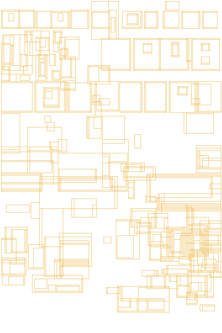
Attack of the Crab Monsters (1957)The title alone takes up the top third of the sheet — followed by the detector firing at every glint, shadow, and film-grain fleck in the pin-up image underneath. This is the "upper bound" caveat made visible: real lettering and pure texture trip the same wire.
text-like coverage 61% (among the highest 0.5% in the dataset)
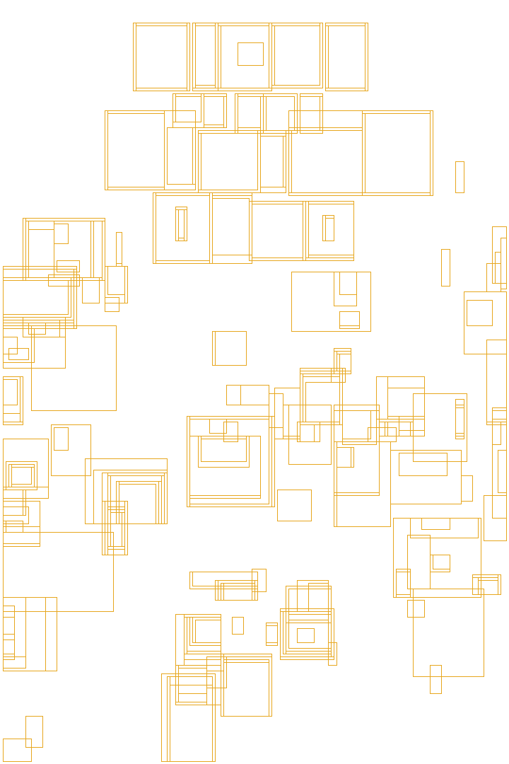
Night of the Living Dead (1968)Still a shout — three stacked words command the top third, boxed almost as tightly as real lettering gets. Most of the density below results from grain and contrast in the collaged faces rather than ink.
text-like coverage 45%
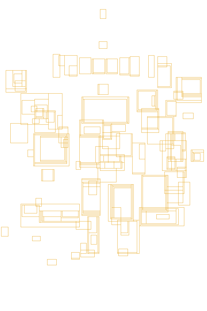
Phantasm (1979)Halfway down the mountain: the logo is a fraction of the '50s peak's size, and it's nearly the only place the detector fires with any real density — the painted illustration itself stays mostly unboxed.
text-like coverage 31%
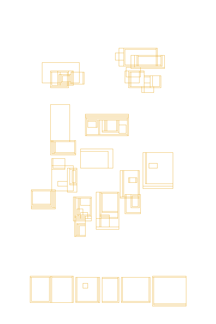
Scream (1996)One word, bottom-anchored, clean sans-serif — the detector boxes it tightly and finds almost nothing else on the sheet. The '90s "meta" look was already most of the way to today's whisper.
text-like coverage 19%
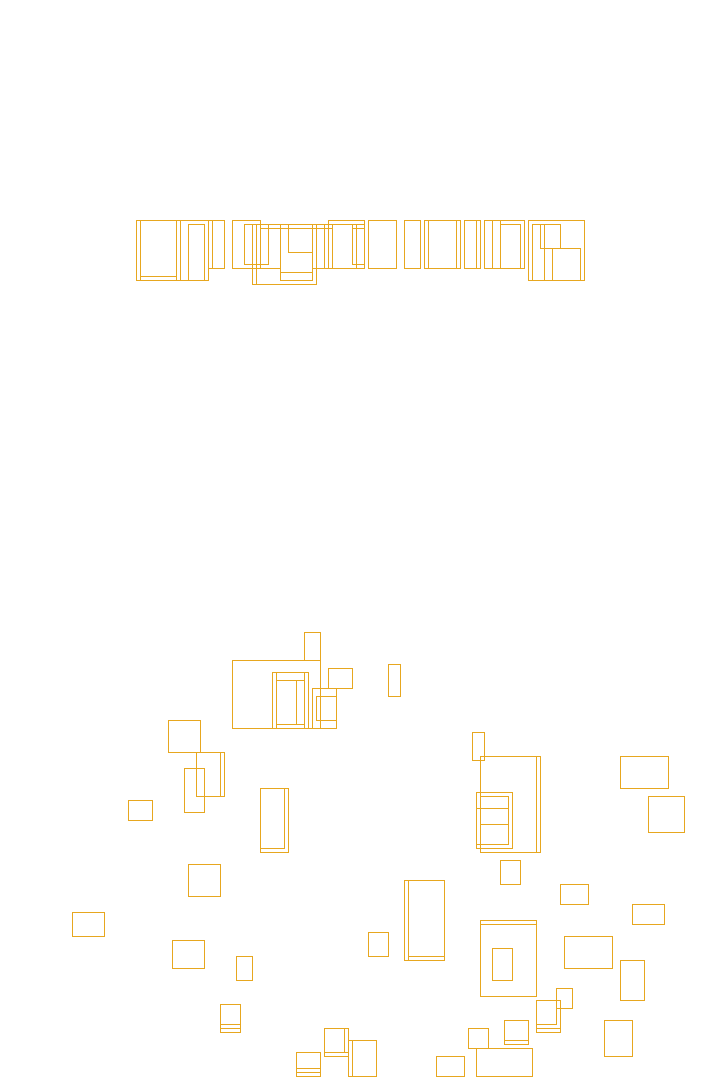
Midsommar (2019)A few stray boxes on the flowers below are nearly the whole reading — the thin serif logo barely registers as text at all. This is the whisper's appearance, pixel by pixel.
text-like coverage 9%
Boxes shown are the actual MSER glyph-candidate regions (delta=5, 15–2,000px² area, 0.1–12 aspect ratio) detected at the same 180px analysis width used for every poster — not merged or cleaned up. The scatter across photographic texture above is the method's honest failure mode: trend-comparable across a century, not a precise per-poster reading. These specimens were run on the 342-px copy shown on the page, not on the full-size image the dataset measured, and the result moves: in the dataset Night of the Living Dead reads 32% (45% here), Scream 27% (19%) and Midsommar 32% (9%). The same poster can read very differently at different resolutions, which is why the chart is a trend and not a per-poster reading.
Second, posters became more symmetrical. Mirror-balance rises through 1980, holds roughly flat for three decades, then rises again after 2010 (about +0.05 on a 0–1 scale) — but not only in horror. Thriller, sci-fi and mystery posters rise by 0.04–0.06 over the same years. It's how movie posters are made now, not a signature of elevated horror.
ALL POSTERS — horizontal mirror similarity (0–1), 5-yr rolling mean.
What mirror similarity actually catches, poster by poster: fold each sheet on the white center line below and ask, pixel by pixel, how far the left half is from the right half's reflection. High scores mean the two halves nearly match; low scores mean they don't. I dropped the live difference heatmap — on asymmetric sheets it just looked like a second, flipped poster — so what you see is the fold the score uses, plus the number.
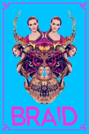
Braid (2019)A kaleidoscope collage built to be mirrored — skulls, faces and antlers folded around dead center. About as close to a true reflection as an illustrated poster gets.
mirror similarity 0.98
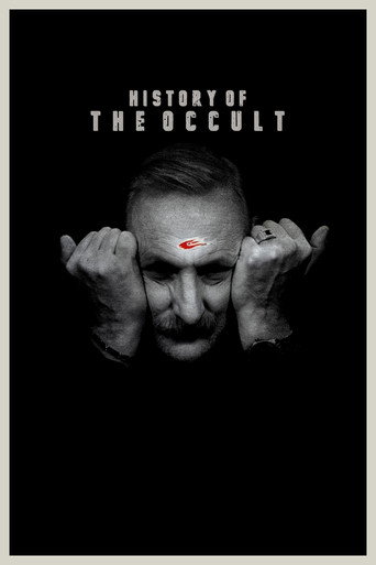
History of the Occult (2023)A face framed dead-center, hands mirrored on both temples — the centered composition that took over movie posters after 2010.
mirror similarity 0.98
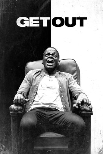
Get Out (2017)A figure dead center, with a background split black on the left and white on the right. To a person, this reads as a balanced, deliberate composition. To a pixel-mirror test, it's a near-total mismatch: a real gap between "centered" and "symmetric."
mirror similarity 0.45
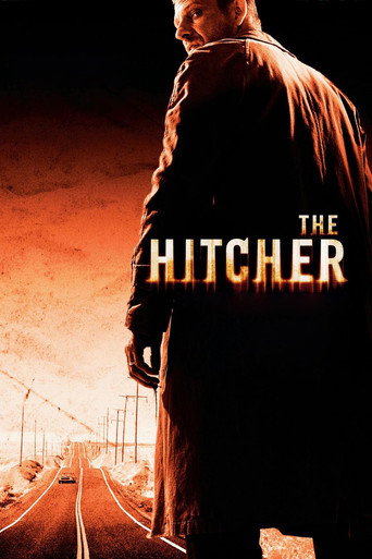
The Hitcher (2007)A single figure planted hard on one side of the sheet, empty road on the other — fold the poster on the white line, and the two halves don't match.
mirror similarity 0.60
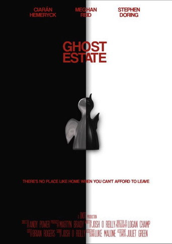
Ghost Estate (2019)The lowest mirror-similarity score in the whole 33,619-poster dataset — on a poster built around a black/white split down the middle. The design quotes symmetry; the pixels don't deliver it.
mirror similarity 0.10 (dataset minimum)
White line = the fold the score uses. I measure per-pixel |gray − mirrored gray| at 64×96 across that midline — high scores mean the two halves nearly match; low scores mean they don't. Caveat: this is pixel-value mirror-match, not human-perceived balance — a centered subject on a split-tone background can score as "asymmetric" even when it reads as balanced. n = 33,619 (TMDB), all posters. History of the Occult is not part of the 33,619-poster corpus.
And third: the compositions themselves stopped leaning. I measured what share of the lines on each poster — a blade, a slashed logo, a body thrown off axis — runs on a diagonal rather than sitting flat and upright. It peaks in the atomic-pulp years, from the '40s to the '60s, steps down in the '70s, holds until the '90s and then keeps falling: today's horror poster stands up straight.
ALL POSTERS — n = 33,619 posters, share of Hough-detected line length at a 25–65° angle, 5-yr mean. A real share of this is stylized diagonal title lettering, not only figure pose — see Sources. The score runs about 11 points higher on TMDB images than on release-year originals, evenly across decades, so read it as a direction, not a level. On 903 films from 1930–1999 the fall shows up in both sources (about −5 points); after 1999 there is no original to compare against.
What does a high diagonal score actually look like on the sheet? Five specimens the algorithm flagged, spanning five decades, none of them repeated from Exhibit A or B. The red dashed lines below are the real output of the same Hough-transform pass charted above — not illustrative, but detected. Watch each sheet dim so that the lines can take the stage.
Doctor X (1932)The title lettering isn't near a diagonal — it is one. A giant yellow "X" slashes corner to corner, doing triple duty as logo, warning sign, and composition.
diagonal score 0.65
It Came from Outer Space (1953)The fleeing cast is arranged on one long sightline toward the saucer's glow, and the stacked title climbs the same angle up the right edge.
diagonal score 0.58
The Howling (1981)Four diagonal claw-rips cut across the frame, guiding the viewer's gaze from the screaming mouth to the empty space — violence depicted through pure geometry.
diagonal score 0.64
Spawn (1997)One uninterrupted cape edge runs the full length of the sheet, corner to corner — the whole silhouette built as a single diagonal blade.
diagonal score 0.76
AVP: Alien vs. Predator (2004)Two creature heads, two studios' worth of IP, arranged along one diagonal seam — Alien upper-left, Predator lower-right, the rivalry staged as a fault line.
diagonal score 0.69
Lines shown are the actual longest Hough segments (of ≥25 total per poster on average) that fell in the 25–65° diagonal band for that specimen, at the same 180px analysis width used for every poster. Animation dims the artwork so the detected segments can be read; hover any poster to pause. Specimen scores are computed on the page's reduced copy; the dataset value for the same poster can differ (The Howling 0.57, AVP 0.39 in the dataset).
Part VI · Lettering
From Painted Letters to One Thin Word
Color wasn't the only language on the sheet — so was the title. And titles got quieter too. In the 1940s, 62% of posters wore ornate display lettering. 3% were minimal. By the 2020s, that flipped — ornate down to 12%, minimal up to 29%, now the single largest register. Fear stopped shouting its own name. And it isn't only horror: thrillers and mysteries made the same move earlier and went further, and sci-fi held on to ornate lettering longer than horror did.
My reading. The 1940s lettering was hand-painted by Universal artists like Karoly Grosz — it was craft. But by the 2010s, A24 turned typography into prestige. A single thin word on black doesn't just look modern — it says that this movie is art, not a monster movie. Ornate became "cheap." Minimal became "elevated." The letters changed because the marketing did. The critics didn't get the memo. Measured, though: across 1,714 films with a Metascore, a thin minimal title earns no better reviews than an ornate one from the same decade (critics: −0.7 points for ornate, 95% interval −3.9 to +2.3). The poster sells a mood; it doesn't predict the verdict.
FULL CENTURY — n = 33,619 posters (TMDB). Registers are quintiles of an ornate↔minimal typographic axis (CLIP zero-shot on the whole poster: similarity to "ornate hand-drawn display lettering" minus "clean minimal type"). Validated against 10 hand-ranked specimens (corr 0.85, 95% interval 0.48–0.96); across the 11 decades 1920–2020 the ornate share falls with the decade at r = −0.93 (per poster the axis correlates with year at −0.28). This measures the decorative character of the title treatment, not a specific typeface — a proxy, honest about its limits: reading the exact letterforms of stylized horror titles defeats OCR and font-ID models alike. REVIEWS — OMDb Metascore and IMDb rating (100+ votes) for 1,714 corpus films; titles compared within the same decade. GENRES — the ornate↔minimal axis is on one scale across genres, so the genre comparison uses the axis itself; the register percentages in the text are quintiles within horror.
The most- and least-ornate title treatment the model found in each era. Fear's lettering thins from painted, dimensional logos to a single quiet word.
Thirds Perfect,
Still Off-Balance
A poster represents a design decision beyond just selecting a color. I measured three things per sheet — rule-of-thirds placement, saliency balance, and shared alignment lines between design blocks — with plain OpenCV geometry. The three specimens below are not the same overlay: Jaws and Halloween show thirds + balance; The Exorcist shows the third measure, alignment, which only reads when separate credit/title blocks share a line.
thirds + balance
Jaws (1975)The shark-and-swimmer mass (amber box) aligns nearly perfectly with a thirds intersection (amber dot compared to white centroid dot), while the saliency-weighted "visual weight" (red dot) is almost exactly at the true center (hollow ring). Two independent measures agree: this is a textbook-balanced shot.
thirds distance 0.15 · balance offset 0.04 — both near-best among the classics I spot-checked
thirds + balance
Halloween (1978)By rule-of-thirds this is the best-placed shot I checked — the knife-and-pumpkin mass sits right on an intersection. But its visual weight (red dot) is nowhere near center: the black void below empties two-thirds of the frame on purpose. The same poster can be both thirds-perfect and off-balance, and here, that imbalance is intentional.
thirds distance 0.14 · balance offset 0.25 — deliberately, not accidentally
alignment lines
The Exorcist (1973)Different overlay on purpose: alignment, not thirds. Nine separate design elements — tagline, credit blocks, the silhouette. The algorithm identified matching lines: these two credit blocks, located on opposite sides of the sheet, align perfectly along the same horizontal (highlighted). A second, unmarked match: the tagline's left edge lines up with the illustration's edge.
alignment score 0.056 (lower = tighter grid) · 9 elements, 2+ confirmed shared lines
Grid & alignment via connected-component clustering of MSER text regions + gradient-magnitude contours (no LayoutParser/Detectron2 — see Sources). Balance via saliency-map centroid (OpenCV StaticSaliencySpectralResidual). Caveat: for full-bleed painted posters without one isolated figure, the "main visual mass" box can span nearly the whole sheet — thirds-distance then measures the whole composition's center of gravity, not one subject's placement. n = 33,619 (TMDB), all posters. The Exorcist's alignment score is 0.056 on the copy shown and 0.097 in the dataset.
One more shape, measured differently — not by the angle of a line but by the width of the composition. Picture slicing a poster into 8 horizontal strips and asking, strip by strip: how much of this row is visually "busy" — edges, contrast, detail — versus empty space? Below, the amber/red bands are that busy width, one per strip. A wide band low on the poster and a thin or missing one up top read as a pyramid; the reverse reads as an inverted funnel. Five real specimens — none repeated from elsewhere in this piece.
Web of Deception (1989)Four faces lined up shoulder to shoulder across the full width of the bottom third — above them, almost nothing but blank space. About as literal a pyramid base as the dataset offers.
pyramid shift +0.56 (wide base)
The Chameleon Killer (2003)The killer's robe narrows toward the head; the row of tombstone silhouettes along the bottom edge is the widest, busiest strip on the whole sheet.
pyramid shift +0.50 (wide base)
Vampire Bats (2005)The inverse: a swarm spans nearly the full width across the top third, fangs bared dead-center — then the entire bottom half of the sheet is flat, empty black. There is nothing for the bands to measure down there.
pyramid shift -0.56 (wide top)
The Returning (1983)The top third is pure flat black — zero measurable detail. All of this poster's visual "weight" sits low: a wide wash of color and the title block, spanning most of the sheet's width.
pyramid shift +0.56 (wide base)
The Nothing (2011)Barn doors thrown open, five figures inside — busy, wide, and consistent across the upper five-eighths of the sheet. Below the doorframe: nothing, literally, all black.
pyramid shift -0.55 (wide top)
Bands: energy-weighted horizontal spread of gradient magnitude per 8 vertical bins, drawn at their real measured width and position. Picked for a clean, unambiguous signal — filtered out logo-only title cards and letterboxed video-still posters, which can fake the same number without a real compositional pyramid behind it. Across the full 33,619-poster dataset this measure averages out to roughly zero by decade — top-heavy and bottom-heavy compositions largely cancel out. It's a real per-poster signature, not a century-level trend (unlike diagonal composition — see Part V). Web of Deception (a non-English original) and Vampire Bats (a TV movie) are not in the 33,619-poster corpus. The Nothing reads −0.55 on the copy shown and −0.04 in the dataset.
Part VIII · Other Genres
Is It Just Horror?
Partly. Text shrank on sci-fi, mystery and thriller posters too — about a fifth of the sheet today in all four categories. Faces fell everywhere; horror just started lower and stayed lowest. Black is the one thing horror kept for itself: 51% of the sheet in the 2020s, against 40–44% in the others.
OTHER GENRES — sci-fi (8,338), mystery (6,895) and thriller (17,646) posters measured with the same method and the corpus's filters: current TMDB genre, English original language, released, no Animation, Music or TV Movie, and no Horror tag, so no film counts as both. A film can be in two of the three. Horror is the 33,619-poster corpus. Decade means, 1930–2026, decades with 100+ posters. Near-black share as in Part II, YuNet faces as in Part IV, MSER text-like coverage as in Part V.
Act II · Autopsy
Dissect any poster
Click any sheet in the century above — or search for a title. The one-sheet takes the light table. Scroll and the same measurements I ran on all 33,619 posters peel off in layers: color, faces, lettering, creature, composition, pose.
Or pick a fear
Matched by CLIP, the same model that counts the monsters, looking at the image alone. It also reads printed titles, so I told it to ignore part of that, and gave well-known films a slight push. Each poster shows up under one fear only. It’s a way in, not a measurement.
A Century of Fear, Getting Quieter
If you love horror films and love finding patterns in data, this is what I found: for a century, horror posters have been showing fewer faces, cutting their text and sliding into black. Fear has been getting quieter ever since we learned to listen to the dark.
The posters don't lie. They tell you everything about what scared us, when, and why. You just need to know how to read them.
Sources & methods
Film list and poster images from The Movie Database (TMDB). The published corpus is 33,619 English-language horror films, already released, with a servable poster, a valid year (1900–2026), no adult flag, and without Animation, Music, or TV Movie. Length is not a filter: about four in ten run 40 minutes or less. Exclusion lists remove 315 more titles: films with no usable poster, films not actually in English, compilations, video magazines, duplicates on TMDB, and a few music or animated titles TMDB hadn't tagged. Each poster is the image TMDB lists as the film's main poster at the cutoff date (2026-10-08), not necessarily the original release sheet: for older films it is often a different image. On 903 films from 1930 to 1999, only 13% matched the release-year poster from IMPAwards and 68% did not. The check says the image changed, not what it changed into. Read the trends as how horror posters look on TMDB today.
Each chart explains its measure and its limits in the note below it.
The code is open on GitHub: the corpus validation (poster-corpus-validation), the per-poster metrics (poster-metrics-pipeline) and the cloud setup that ran them at scale (poster-analysis-infrastructure).
Poster-design credits from IMPAwards, verified against each film's IMDb title (see Who designs fear).
Further reading on horror poster art: seven books, checked against publisher and library records.
Film facts in the autopsy (length, rating, country, language, director, cast, release date) and the posters TMDB lacks come from OMDb (CC BY-NC 4.0), matched by IMDb ID. This product uses the TMDB API but is not endorsed or certified by TMDB.