Creating Stories from Data: A Guide to Impactful Communication (Data Storytelling Volume I)
Discovering the Hidden Power Behind Numbers and Statistics


Welcome to our series on effective data communication! Over the following four parts, we’ll dive into how to turn complex data into engaging stories that grab attention and inspire action.
- Part 1: Creating Stories from Data
- Learn the essentials of an exemplary data story: data accuracy, relevance, a narrative, and visualization. - Part 2: Mastering Written Reports
- Learn the differences and get tips for writing reports and giving presentations. - Part 3: Enhancing Oral Presentations
- Learn how to captivate audiences in an information-saturated world. - Part 4: Advanced Techniques and Practical Examples
- Use advanced techniques. Learn from examples. They will boost your data communication skills.
“No one ever made a decision because of a number. They need a story.” (Kahneman, as quoted in Lewis, 2017)
Intro to Data Communication
Data communication is an essential skill for any data professional. Stories help simplify complexity, provide necessary context, and communicate insights more persuasively. In an information-saturated environment, telling stories with data ensures that our ideas are understood and remembered.
¿Why Tell Stories with Data?
Analyzing data and obtaining results isn’t enough. Presenting those findings clearly is vital, especially to non-technical colleagues, managers, and clients. The narrative isn’t about “decorating” data; it’s about making it accessible and memorable. A well-told data story can grab attention, provide context, and ease decision-making.
Have you ever been in a meeting where everyone’s focused on debating whether a data point is accurate? Because our data is mathematically sound and well-calculated, it’s easy to believe that simply presenting data is sufficient. However, without context, data can be misleading. But presenting data without context — or without considering whether it contributes to the story or helps decision-making — isn’t the best approach for building a data-driven culture. This is why crafting solid data stories that generate real impact is significant. So, let’s define what a data story is.
What is a data story?
It’s the practice of building a story around a dataset and its visualizations to help communicate the meaning behind the data. Our job as data professionals is to turn complex tables and charts into stories that inform and inspire action.
Elements of a Data Story
To build a meaningful data story, consider these elements:
- Context: Set the scene. Provide essential background to show why the data matters.
- Challenge: State the problem or question that the data addresses. This sparks interest and engages the audience.
- Response: Describe the proposed solutions or actions. Use data to support the approach.
- Outcome: Demonstrate how the actions made a difference and emphasize the benefits of the data insights.
The Essentials: Data, Narrative, and Visuals
A robust data story relies on three core elements:
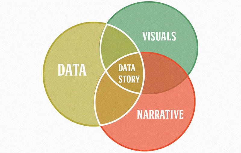
- Data: Utilize accurate and relevant data that supports the main conclusions and is grounded in dependable analysis.
- Narrative: Keep the narrative concise and focused, making it easy to understand and tailored to the audience.
- Visuals: Graphics should complement the narrative, helping to make data more understandable.
“To make converts is the natural ambition of everyone.” (Goethe, n.d.)
The goal of telling data stories is to persuade the audience to embrace the ideas and recommendations based on shared insights.
Data: The Foundation of an Effective Story
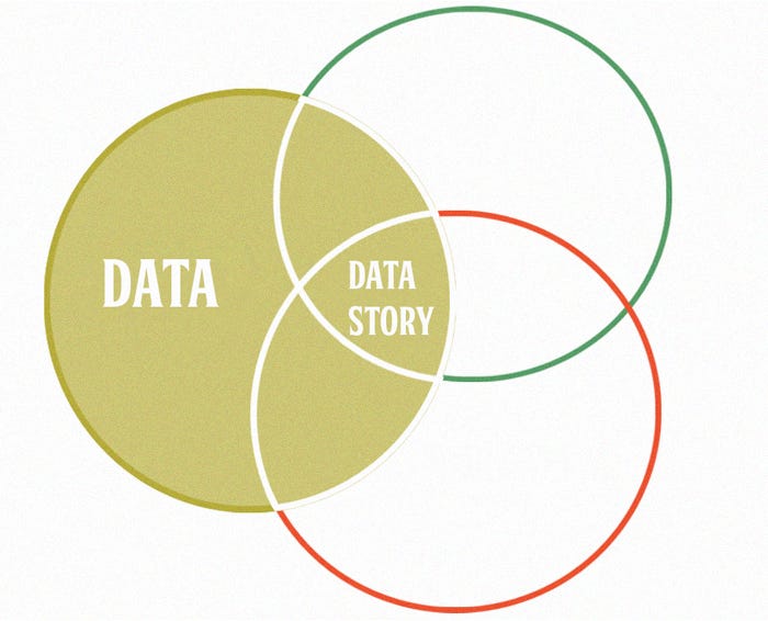
The strength of any story lies in the accuracy and relevance of the data itself. Reliable data adds credibility and ensures that your audience can make informed decisions. Let’s explore how these principles support a solid, persuasive data story.
The Importance of Accuracy and Relevance
Accurate data serves as the backbone of any reliable analysis. Misleading data can lead to wrong conclusions and poor decisions. For example, a retail company might base strategic decisions on what looks like high customer demand, only to discover later that it was an overestimation due to a temporary promotion. This mistake cost the company financially and operationally, underlining the need for precise data.
“Consider the case of a retail company that decided to expand its operations into a new region based on promising sales data. The data indicated high interest and demand for its products in this region, which led the company to invest significantly in new retail locations, marketing, and hiring staff.
However, after several months of operation, sales in the new region were well below expectations. After investigating, the company found that a data collection error had misinterpreted the initial sales data. A temporary promotion had artificially inflated the sales figures, leading to a misleading impression of ongoing demand.
This misinterpretation led the company to make misguided strategic decisions, resulting in significant financial losses and decreased staff morale. The company had to close several new locations and restructure its operations, learning the costly lesson of ensuring data accuracy and relevance before making strategic decisions.”
Beyond accuracy, data relevance is crucial. Not all available data is helpful for every analysis. Relevance shows how closely the data relates to the questions or problems we address. Irrelevant data can distract from crucial points and unnecessarily complicate the narrative. Thus, it’s essential to select and use only the data that directly supports the main conclusions of the data story.
“Consider the case of a tech company developing a new mobile application. The development team collected much data on the latest mobile devices’ technical features and hardware specifications during the design process. This data included details on battery capacity, screen resolution, and processor speed. Although this data was accurate and detailed, it wasn’t fully relevant to the main problem the company was trying to solve: improving the user experience in the application. The data on device technical specifications diverted the team’s attention from the real issues users face, such as ease of navigation, app responsiveness, and accessibility of key features. Instead of focusing on more relevant data, like app abandonment rates, user feedback on usability challenges, and usage time statistics, the team focused on optimizing the app for the most advanced hardware, overlooking the needs and experiences of a significant part of its user base who used older or less powerful devices.”
Narrative: Crafting an Engaging Data Story
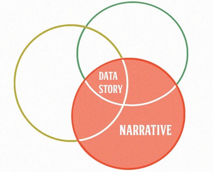
The narrative is the guiding thread that brings meaning to data, transforming it into understandable and memorable stories. In data communication, a good narrative should be concise, centered on a critical point, and tailored to the technical knowledge level of the audience. We will explore the importance of narrative and its elements and how to create a data story that informs, inspires, and motivates the audience to act.
The Importance of Narrative in Data Communication
Data can be overwhelming and difficult to interpret on its own. That’s why narrative provides the necessary context to give data meaning and relevance. By connecting data with human experience, narrative makes information more accessible and emotionally resonant. For example, rather than presenting quarterly sales statistics, a narrative might tell the story of a specific customer and how the product or service has positively affected their business, illustrating how the data translates into real, tangible benefits for customers.
Translating Technical Results
Conveying technical results that resonate with non-technical audiences is crucial to effective communication. This skill is vital for ensuring understanding and engagement across diverse groups.
You can try using:
- Using Analogies and Examples: Simplifying complex concepts using analogies and examples that are easy to relate to.
- Understanding the Audience: Tailoring the level of detail and terminology to match the technical expertise of stakeholders.
- Focusing on Impact: This approach emphasizes how the results affect the business or specific situation rather than the technical details of the analysis.
We can use techniques such as ADEPT to put these points in place.
The ADEPT framework by Jonathan Schwabish is a practical approach to data storytelling. ADEPT stands for:
- Attention: Capture the audience’s attention from the start.
- Development: Provide context and essential details.
- Emotion: Connect emotionally by highlighting the human side of the data.
- Plot: Ensure a logical, clear story structure.
- Takeaway: End with a clear, memorable conclusion.
Visuals: The Power of Visual Communication
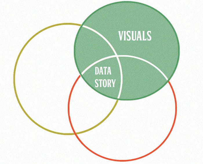
Visuals are crucial in conveying complex information clearly and briefly. Graphics need to be clear, precise, and engaging.
“Some colors reconcile themselves to one another. Others just clash.” (Edvard Munch, n.d)
Like colors, some elements complement and reinforce the message in visualizations, while others can create confusion if not chosen or structured correctly.
The Power of Visuals in Communication
Images can convey information more quickly and efficiently than text alone. Our brains process images 60,000 times faster than text, and 90% of the information transmitted to the brain is visual. This means data visualizations can capture viewers’ attention and communicate complex messages in an easy-to-understand and memorable way. For instance, a bar chart can show a company’s annual sales trends at a glance, while a detailed text report might take much longer to read and understand.
Design Principles for Effective Graphics
To make data visualizations effective, they should be clear, accurate, and appealing. Below are some fundamental principles for creating compelling graphics:
- Clarity: Ensure that the graphics are clear and easy to understand. Avoid unnecessary complexity that might confuse the audience.
- Consistency: To maintain visual coherence, use a consistent style across all your graphics. This process involves using consistent colors, types of charts, and labeling throughout the entire project.
- Simplicity: Less is more. Remove any redundant elements that don’t directly contribute to the main point.
- Accuracy: Graphics should represent data accurately and avoid any distortion that might lead to misinterpretation.
- Focus on the main message: Each graphic should have a clear, central message. Avoid information overload, and ensure that the main point is easily identifiable.
- Effective use of space: Balance the elements within the chart to avoid overcrowding or emptiness.
- Select the appropriate chart type: Different data types require different chart types. Choose the chart that best represents your data and facilitates its interpretation.
- Clear and descriptive labels: Use clear, descriptive labels to help the audience understand the data quickly. Include units of measure and dates when necessary.
- Use of colors and contrasts: Use colors and contrasts effectively to highlight important information. Avoid color combinations that may be hard to distinguish for people with color blindness.
- Avoid excessive visual effects: Shadows, 3D edges, and gradients can distract and complicate data interpretation. Use these effects sparingly and only if they enhance the chart’s clarity.
These principles help ensure graphics are visually appealing, informative, and easily interpretable.
Integrating Visualizations into Our Data Stories
Data visualizations should effectively present information and weave it into a cohesive narrative that guides the audience through the data story. Data storytelling combines data, visualizations, and a narrative to create a powerful and memorable message. Here are some practices for integrating visualizations into a data story:
- Strategic Planning with Storyboards: A storyboard helps plan your data story. It helps organize visualizations in an order that supports the story and creates an emotional impact on the audience. The storyboard process allows creators to experiment with various sequences and approaches until they identify the most effective structure. This strategic planning ensures that each visualization aligns with the central message and flows logically.
- Straightforward and Honest Communication: Communicating results clearly and honestly is essential. Transparency in data communication helps build trust with the audience. Ensure that visualizations are accurate and do not misleadingly manipulate data. Avoid exaggerations and present information in a way that stays true to the original data. Honesty in data representation strengthens the credibility and the effectiveness of the narrative.
- Dual Coding: Dual coding combines visual elements with text or audio to reinforce the message. When describing graphics in a presentation or document, ensure the explanations are clear and support the visualization. This approach enables the audience to understand better the data presented and enhances the presenter’s credibility as a subject matter expert.
Conclusion
Telling stories with data is a crucial skill in the modern world, where the ability to convey information quickly and effectively can make a difference in decision-making and understanding complex data. By following the principles of effective graphic design, choosing the appropriate chart type, and maintaining credibility in data visualizations, we, as data professionals, can significantly improve the quality of their communication. Integrating visualizations into a coherent and meaningful narrative informs the audience and inspires and motivates them to act based on the data presented.
In our next article, we’ll examine the two most common data communication formats — written reports and oral presentations — and provide practical tips for using each one effectively.
References
- Lewis, M. (2017). The undoing project: A friendship that changed our minds. W.W. Norton & Company.
- Goethe, J. W. (n.d.). To make converts is the natural ambition of everyone. Retrieved from https://quotation.io/quote/make-converts-natural-ambition-everyone
- Munch, E. (n.d.). Some colors reconcile themselves to one another, others just clash. BrainyQuote. Retrieved from https://www.brainyquote.com/quotes/edvard_munch_370129
